
How Far Is Too Far
Client:
Abram Goff
Project Overview:
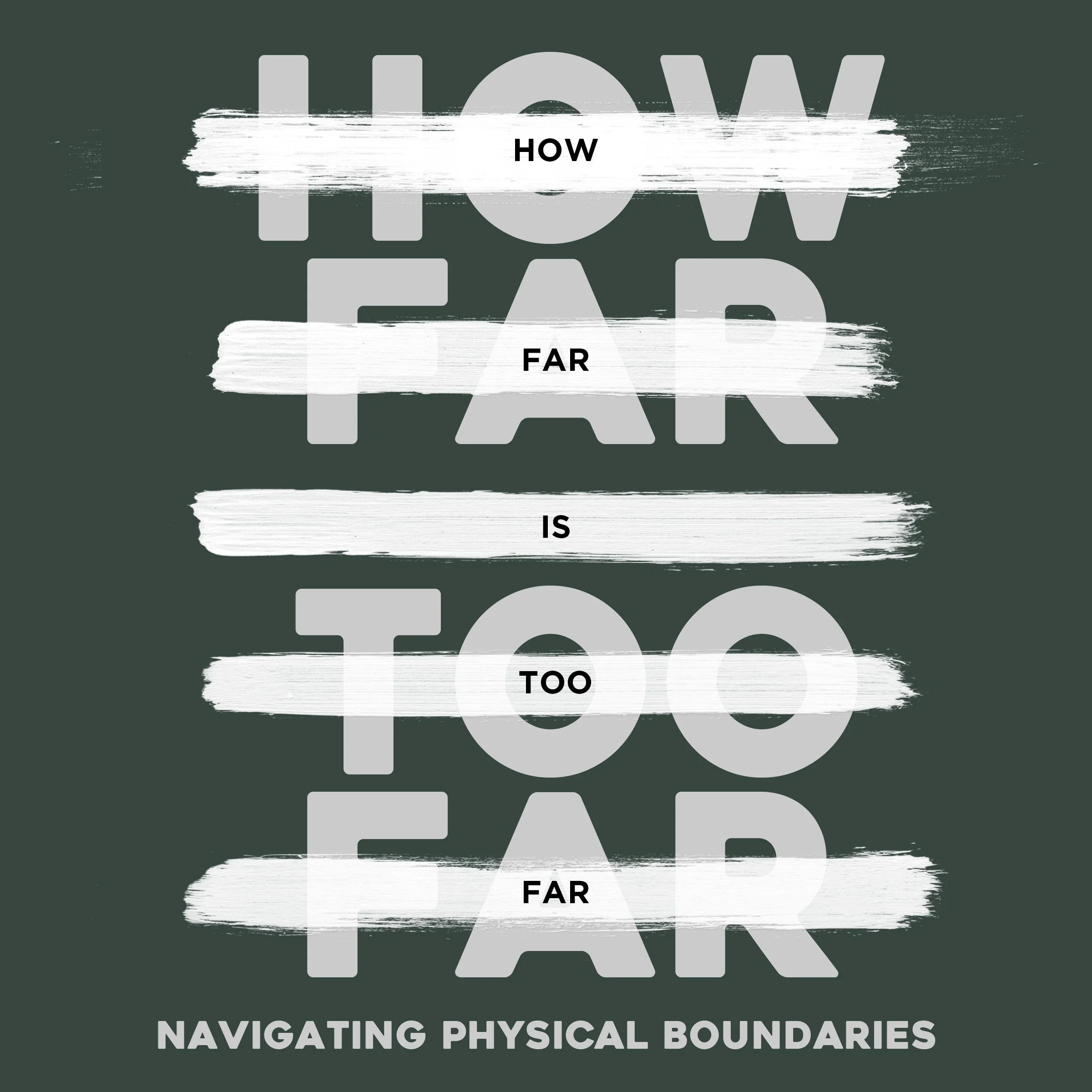
How Far Is Too Far is a video series and upcoming book. The focus was to discuss healthy physical boundaries in dating while avoiding cliche stereotypes.
Specific Notes & Challenges:
The design needed to be able to stand out on a shelf or on a list of products on a screen.
We wanted to focus on the physical aspect of relationships without becoming explicit.
In the end we focused on a bold typeface with the question users are looking for while adding in brush strokes. The strokes represent "the line" individuals are looking for and the semi-messy nature of relationships that are created and not clearly defined.
Client:
Abram Goff
Project Overview:
How Far Is Too Far is a video series and upcoming book. The focus was to discuss healthy physical boundaries in dating while avoiding cliche stereotypes.
Specific Notes & Challenges:
The design needed to be able to stand out on a shelf or on a list of products on a screen.
We wanted to focus on the physical aspect of relationships without becoming explicit.
In the end we focused on a bold typeface with the question users are looking for while adding in brush strokes. The strokes represent "the line" individuals are looking for and the semi-messy nature of relationships that are created and not clearly defined.